
Typeface poster
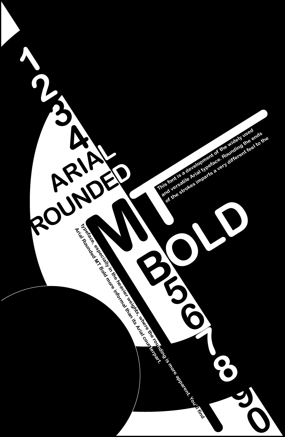
I was informed to keep it at a simple black an white. and try and use every letter and number.
-Tried to utilize a ying and yang inspired theme.
-Tried to utilize a balance on the right and left with black and white.
-Made the text black when it touched white and white when it touched black.
-Elongated some letters horizontally and vertically to supply a place where to put text info and guide the eye.
tilted at around 45 degrees to invoke a somewhat odd viewpoint. Action prone versus the normal vertical format. But not rotated enough that its hard to read.
-text used: Arial Rounded MT Bold